7 Types of logos: When, Why, and How to Creatively Use Them
Logo is the first thing that grabs the attention of customers so make sure the logo you design should leave a strong first impression. There are different styles of logo designs that can be customized to create a unique and memorable brand identity. Broadly, we would categorize the logos into seven styles – Monogram, Wordmarks, Lettermark, Pictorial marks, Abstract logo marks, Mascots, Combination mark, and Emblem. Let’s find out more about each one of them:
Lettermark logos
Used to create simple and memorable logos, lettermark is a typography-based logo design that usually comprises a few letters, mostly a company’s initials. This type of logo design is most suitable for brands that have long names. It makes the brand recall easiest and effective. Some of the popular brands with the Lettermark logo includes – IBM, CNN, HP, HBO, NASA etc.
Wordmark logos
Wordmark logos are best suitable for companies that have a succinct and distinct name. These types of logos are font-based and the main focus is on brand’s name, for example – Google. The name is catchy and memorable. When combined with strong typography and the right combination of colours, the logo helps create strong brand recall. A pro tip would be to use a font or infact, create a font—that captures the essence of what business does.
Pictorial logo icons
Pictorial logos, also can be called as logo symbols, are created with unique icons or images. For example, Apple logo, Twitter bird, Target bullseye. The logo of each of these companies is emblematic and so established, that one looks at the icon and you instantly recognize the brand. It is really tricky to design these types of logos. When deciding to create a pictorial mark, make sure you choose an image that will stick with the company its entire existence.
Abstract logo marks
We can say the abstract mark is another version of the pictorial logo. In this type of logo design, instead of a recognizable image—like an apple or a bird—an abstract geometric pattern is created to represent the brand. The most common example includes – Pepsi divided circle and the strip-y Adidas flower. Compared to pictorial logos, abstract logos give more freedom to create something truly unique to represent the brand.
Mascot logos
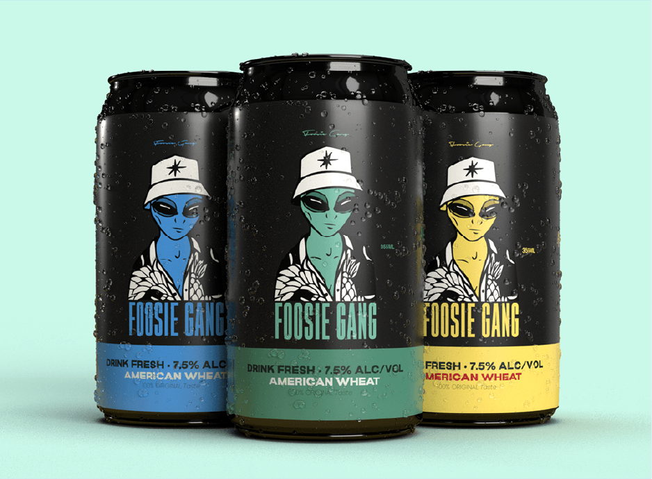
Mascot logos generally involve fun and colourful illustrated characters, for example – Amul, Air India, KFC, Commonwealth Games etc. It would not be wrong to call Mascots as the brand ambassador of the business. Mascot logos are more suitable for brands who want to create appealing images to families and children.
Combination logos
Now if you want to put letters/fonts as well as icons/abstract/mascot in your logo design, create your own hybrid logo or combination logo design. You can lay the picture and text side-by-side, or stacked on top of each other, or integrated together to create an image. Some of the best examples of Combination logos include – Doritos, Burger King and Lacoste. A combination of text and image working together reinforces your brand identity.
Emblem logo
Emblem logo consists of a font inside an image/icon/symbol. Most schools, organizations or government agencies use an emblem logo. However, nowadays, emblem logos are also being used by auto companies, food and beverage industry. Best examples of emblem logos includes – Starbucks’ iconic mermaid emblem, or Harley-Davidson’s famous crest.
If you want to become a good Logo Designer? Join us Today!!
You Might Also Like
Animation: Can You Be Animator by Taking Motion...
Why Mastery in Graphic Design is Important for...
Stay Tuned
Stay up to date with our latest courses.


.png?width=130&height=53&name=image%2027%20(1).png)






.jpg)







.jpg?width=767&name=movie%20poster%20%20(option%202).jpg)
BOOK A FREE CONSULTATION