Mastering the Art of Layout: Crafting Visual Harmony in Graphic Design
Introduction
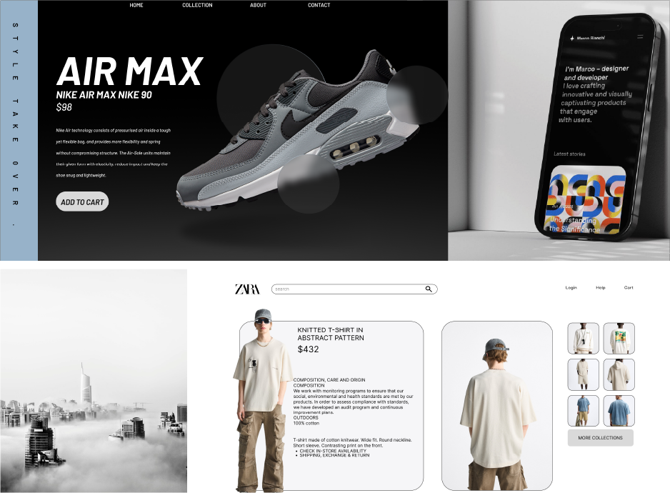
In the world of graphic design, layout is more than just placing elements on a canvas—it's about orchestrating a visual symphony that captivates, communicates, and connects. Whether you’re designing a magazine spread, a website interface, or a poster, the layout serves as the backbone of your design, guiding the viewer’s journey through your content.
What is Layouting?
Layouting refers to the strategic arrangement of text, images, and other visual elements within a design to create an aesthetically pleasing and functional composition. It involves balancing space, guiding the eye, and ensuring clarity to deliver the intended message effectively.
Why is Layout Important?
A well-thought-out layout can:
- Enhance Readability: By organizing content logically, it becomes easier for the audience to digest information.
- Create Visual Hierarchy: It draws attention to the most critical elements first, ensuring the message is clear.
- Establish Brand Identity: Consistent layouts contribute to a cohesive and recognizable brand aesthetic.
Principles of Effective Layouting
- Balance: Strive for visual stability. Balance can be symmetrical, where elements mirror each other, or asymmetrical, creating dynamic tension.
- Alignment: Proper alignment ties elements together, creating a polished and professional look.
- Proximity: Group related items to create connections and reduce visual clutter.
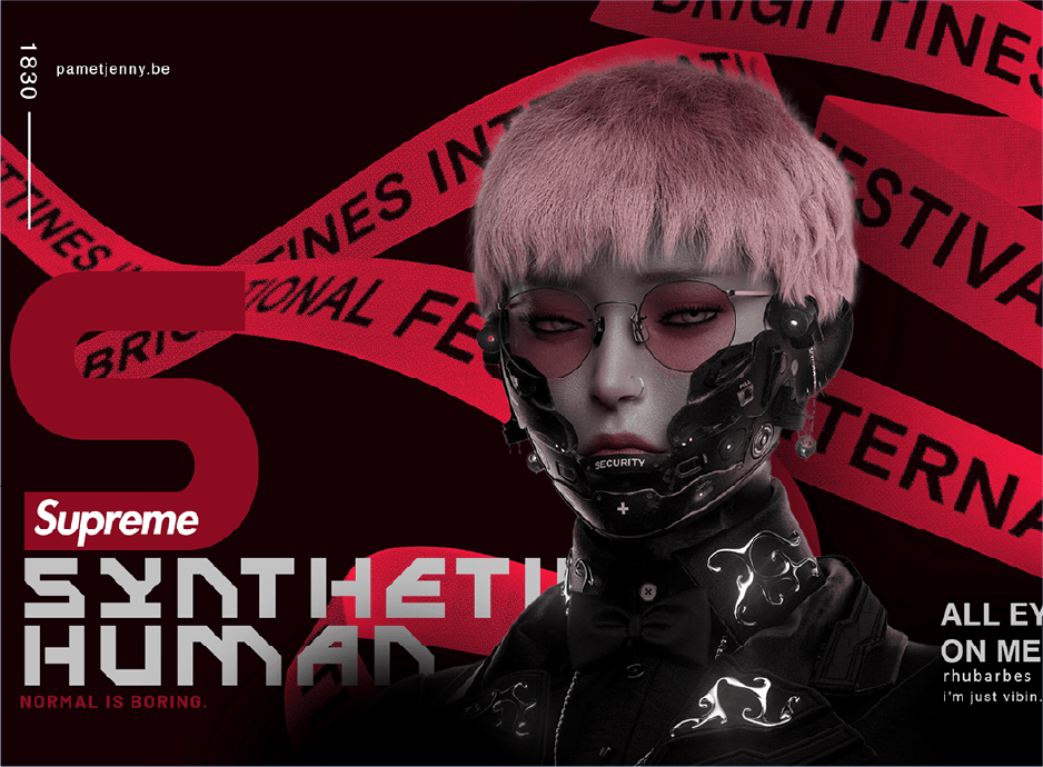
- Contrast: Use contrasting colors, sizes, or fonts to emphasize key elements.
- White Space: Negative space is your best friend. It prevents overcrowding and allows elements to breathe.

Common Layout Techniques
- Grid Systems: Grids are the skeleton of a layout, offering structure and consistency. They help designers align elements neatly and maintain balance.
- Golden Ratio: This classic design principle creates harmony by dividing the canvas into sections based on a 1:1.618 ratio.
- Z-Pattern and F-Pattern: These layouts mimic how viewers typically scan content, ensuring critical information is seen first.
- Rule of Thirds: By dividing your design into thirds, you can create focal points that draw the viewer’s attention.
Tools to Enhance Layouting
From beginners to seasoned professionals, tools like Adobe InDesign, Figma, and Canva provide features to experiment with and refine layouts. Leveraging features like grids, alignment guides, and templates can save time while ensuring precision.
Conclusion
Layouting is the invisible hand that shapes a viewer’s experience. When done right, it seamlessly integrates form and function, turning ordinary designs into extraordinary ones. Whether you’re a budding designer or a seasoned pro, mastering layout principles will elevate your work and leave a lasting impact on your audience.
You Might Also Like
Mastering the Principles of Graphic Design: A...
Crafting Seamless Digital Experiences: The Art...
Stay Tuned
Stay up to date with our latest courses.


.png?width=130&height=53&name=image%2027%20(1).png)


.jpg)

BOOK A FREE CONSULTATION