Mastering the Principles of Graphic Design: A Guide to Creating Impactful Visuals
Introduction
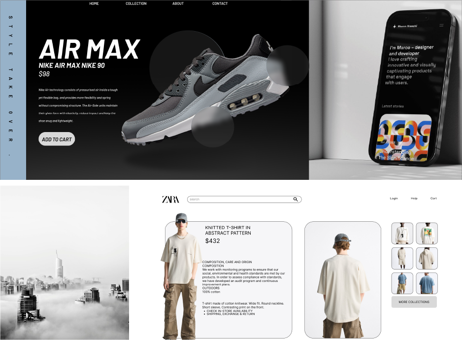
Creating visually appealing and effective designs isn’t just about artistic talent; it’s about understanding the foundational principles of design. These principles help structure your layouts, ensuring that your message resonates with your audience. Here’s a closer look at the six core principles of graphic design—balance, proximity, alignment, repetition, contrast, and white space—and how they can enhance your work.
1. Balance: Achieving Visual Harmony
Balance is about the even distribution of visual weight. Each element on a layout has weight based on size, color, and line thickness. Balance can be:
- Symmetrical: Elements are evenly distributed on either side of a centerline, creating a formal, organized look.
- Asymmetrical: Different elements are balanced by their visual weight, often creating a more dynamic and interesting design.
Tips for Achieving Balance:
- Use larger or darker elements to create heavier visual weight.
- Adjust colors, line thickness, and spacing to achieve harmony.
2. Proximity: Organizing Related Elements
The principle of proximity groups related elements together, helping viewers identify and process related information easily. By placing similar items close together, you can create a clear, organized layout.
Proximity in Action:
- Group similar content (like contact information) together on a business card to make it easy for viewers to find.
- Keep space between unrelated items to prevent a cluttered appearance.
3. Alignment: Creating Order and Connection
Nothing in your design should be placed randomly. The principle of alignment states that every element should visually connect with another, creating a unified layout. Aligning elements brings order and harmony, making designs look polished and cohesive.
Best Practices for Alignment:
- Avoid multiple alignments (e.g., left-aligned text mixed with centered text) on the same page.
- Use grid lines to align elements and create visual flow.
4. Repetition: Building Consistency
Repetition strengthens your design by repeating visual elements, creating a sense of unity and consistency. This could be a specific font, color, shape, or spatial relationship that viewers can identify throughout your design.
Using Repetition Effectively:
- Incorporate repeated elements like logos, fonts, or colors to reinforce a brand identity.
- Avoid excessive repetition to prevent a monotonous design.
5. Contrast: Drawing Attention and Creating Interest
Contrast makes elements stand out and adds interest to a design. It’s also essential for organizing information—clear contrasts between elements make layouts easier to read and navigate.
How to Use Contrast:
- Contrast text sizes, colors, or shapes to emphasize key information.
- Ensure that contrasts are bold and intentional; subtle variations may confuse rather than clarify.
6. White Space: Embracing Simplicity and Clarity
Often overlooked, white space (or negative space) is essential for clarity. It provides breathing room, preventing designs from feeling overcrowded or chaotic. White space doesn’t have to be white—it’s simply the space around your content.
White Space Tips:
- Add space between elements to create an elegant, clean look.
- Use white space around text to improve readability.
Putting It All Together
These six principles are the foundation of great design. They work together to enhance visual communication, helping designers guide the viewer's eye and make a lasting impression. Remember that effective design isn’t about using each principle in isolation but about combining them to create a balanced, cohesive piece that delivers your message effectively. Whether you’re crafting a logo, a website, or a flyer, applying these principles can transform your work from good to exceptional.
Incorporate these design principles into your projects, and watch as your layouts become more organized, appealing, and effective. Mastering these fundamentals is key to achieving a professional, impactful design that resonates with viewers.
You Might Also Like
Mastering Typography: The Art of Creating...
The Essentials of Design: Key Principles for...
Stay Tuned
Stay up to date with our latest courses.


.png?width=130&height=53&name=image%2027%20(1).png)


.jpg)


.jpg?width=767&name=movie%20poster%20%20(option%202).jpg)

BOOK A FREE CONSULTATION