Unlocking the Power of Color: A Guide to Color Psychology in Design
Introduction
Color isn’t just about aesthetics—it’s a language that speaks directly to our emotions and perceptions. From influencing consumer behavior to shaping brand identity, understanding color psychology is a game-changer for designers.
This blog explores how colors impact emotions, the meanings behind popular hues, and how you can strategically use them to create designs that resonate with your audience.
What is Color Psychology?
Color psychology is the study of how colors influence human behavior and feelings. It’s rooted in both cultural associations and biological responses, making it a powerful tool in design, marketing, and branding.
For instance, while red often evokes energy and passion, blue can foster trust and calmness. Knowing these associations helps designers craft experiences that connect on a deeper level.
The Psychology of Popular Colors
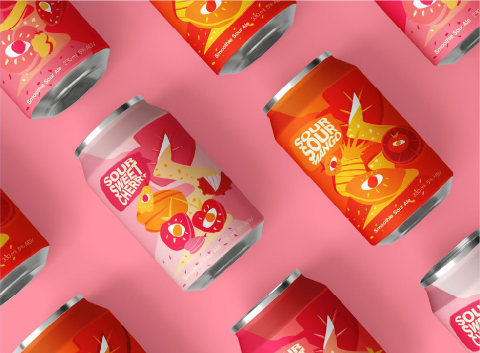
1. Red: Energy and Urgency
- Emotion: Excitement, passion, power.
- Use: Great for grabbing attention, evoking urgency, or stimulating action (e.g., sales promotions).
- Examples: Coca-Cola’s vibrant branding, and clearance sale banners.
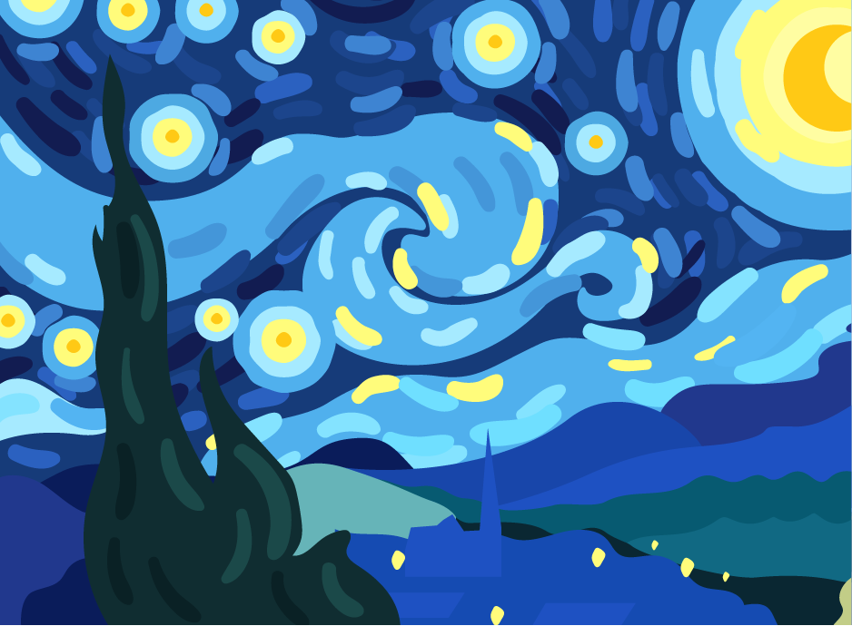
2. Blue: Trust and Stability
- Emotion: Calm, trust, professionalism.
- Use: Ideal for corporate and healthcare industries where trustworthiness is key.
- Examples: Brands like Facebook and LinkedIn.
3. Yellow: Optimism and Creativity
- Emotion: Happiness, warmth, spontaneity.
- Use: To create a cheerful, inviting atmosphere.
- Examples: McDonald’s golden arches, Snapchat’s playful yellow.
4. Green: Growth and Balance
- Emotion: Nature, health, prosperity.
- Use: Perfect for eco-friendly brands, wellness products, or financial services.
- Examples: Whole Foods’ branding, and Starbucks’ iconic green.
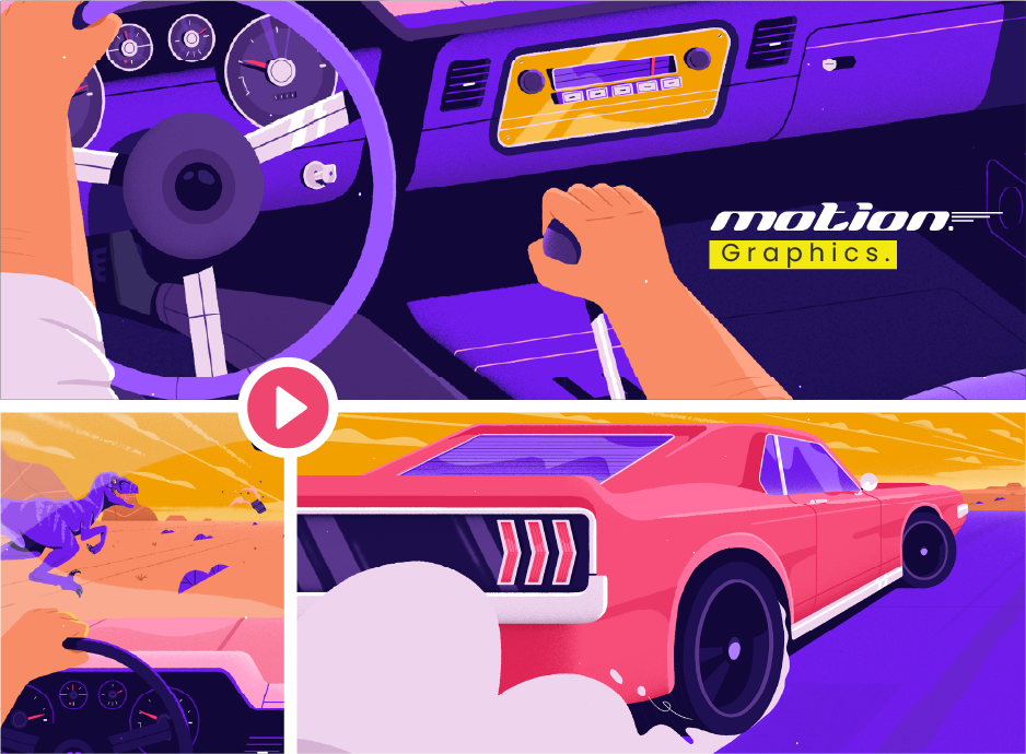
5. Purple: Luxury and Mystery
- Emotion: Sophistication, creativity, spirituality.
- Use: Often associated with premium products and creativity-focused brands.
- Examples: Cadbury’s indulgent purple, Twitch’s creative platform.
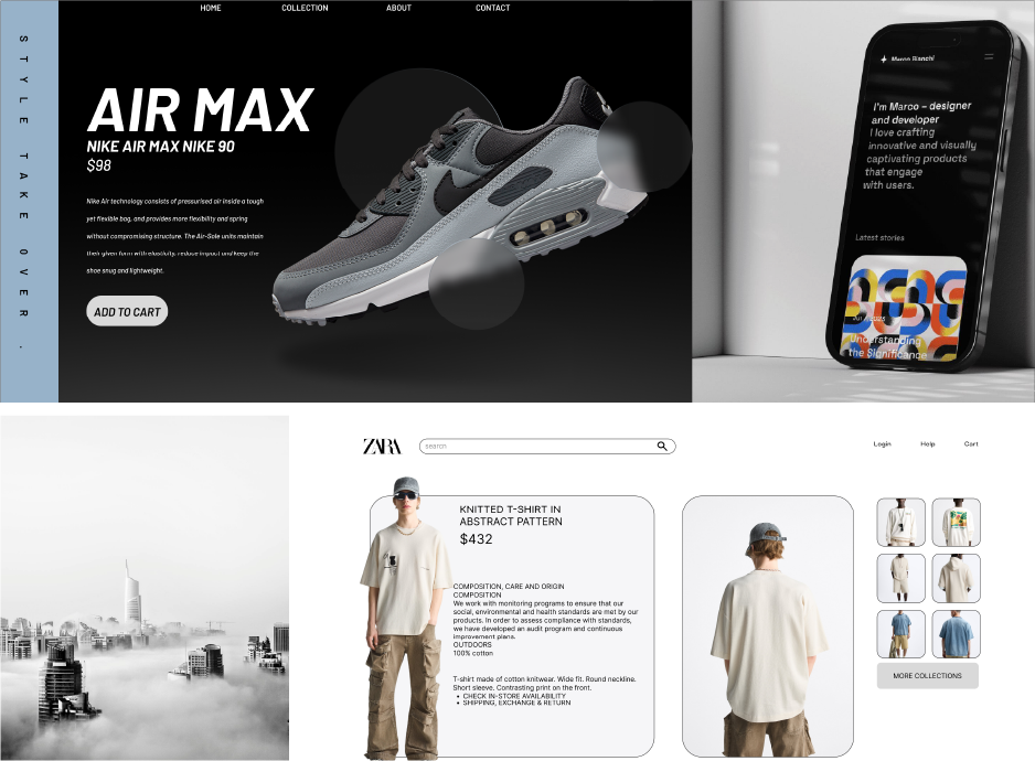
6. Black: Elegance and Power
- Emotion: Sophistication, mystery, authority.
- Use: High-end branding or minimalist aesthetics.
- Examples: Chanel’s luxury appeal, and Apple’s sleek designs.
7. White: Simplicity and Purity
- Emotion: Cleanliness, neutrality, openness.
- Use: Common in healthcare, tech, and minimalist design.
- Examples: Tesla’s modern simplicity, and wedding-related branding.
How to Use Color Psychology in Design
-
Understand Your Audience
- Research your target demographic’s preferences and cultural associations with colors. For instance, red signifies good fortune in China but can symbolize danger in Western contexts.
-
Align with Brand Values
- Choose colors that reflect your brand’s mission and identity. A tech company may lean toward blue for trust, while a toy brand might favor bright primary colors.
-
Create Visual Hierarchies
- Use contrasting colors to guide users’ attention. For instance, a bold red button on a neutral background can prompt quick action.
-
Balance with Neutral Tones
- Pair vibrant colors with neutral tones like gray, white, or beige to maintain balance and sophistication.
-
Test and Refine
- Use A/B testing to measure how different color schemes influence user behavior and conversion rates.
Common Pitfalls to Avoid
- Ignoring Accessibility
- Ensure your color combinations meet accessibility standards (e.g., sufficient contrast for text readability).
- Overusing Bright Colors
- While vibrant colors attract attention, overusing them can overwhelm users and dilute the message.
- Neglecting Cultural Context
- Colors carry different meanings in different cultures. Be mindful of your audience's background when selecting a palette.
Tools for Choosing Colors
- Adobe Color: Generate palettes and test color harmony.
- Coolors: Quickly create and refine color schemes.
- WebAIM Contrast Checker: Ensure your designs are accessible.
- Canva Color Wheel: Explore complementary, analogous, and triadic color combinations.
Conclusion
Color psychology is more than an art—it’s a science. By understanding the emotional and cultural significance of colors, you can create designs that inspire trust, evoke joy, or compel action.
The key is to be intentional with your choices. Align your palette with your message, test its impact, and remember that a thoughtful use of color can turn a good design into a great one.
You Might Also Like
Beyond the Box: Exploring the Art of Print and...
Breaking Down Creativity: A Graphic Design Case...
Stay Tuned
Stay up to date with our latest courses.


.png?width=130&height=53&name=image%2027%20(1).png)


.jpg)
BOOK A FREE CONSULTATION